webyaam

Responsive design

Style each of the four breakpoints separately.

2 min readGuide 8 of 20

Breakpoints

Webyaam has four breakpoints: desktop, tablet, landscape and mobile. Desktop is the base. Styles you set on a smaller screen override only that screen.
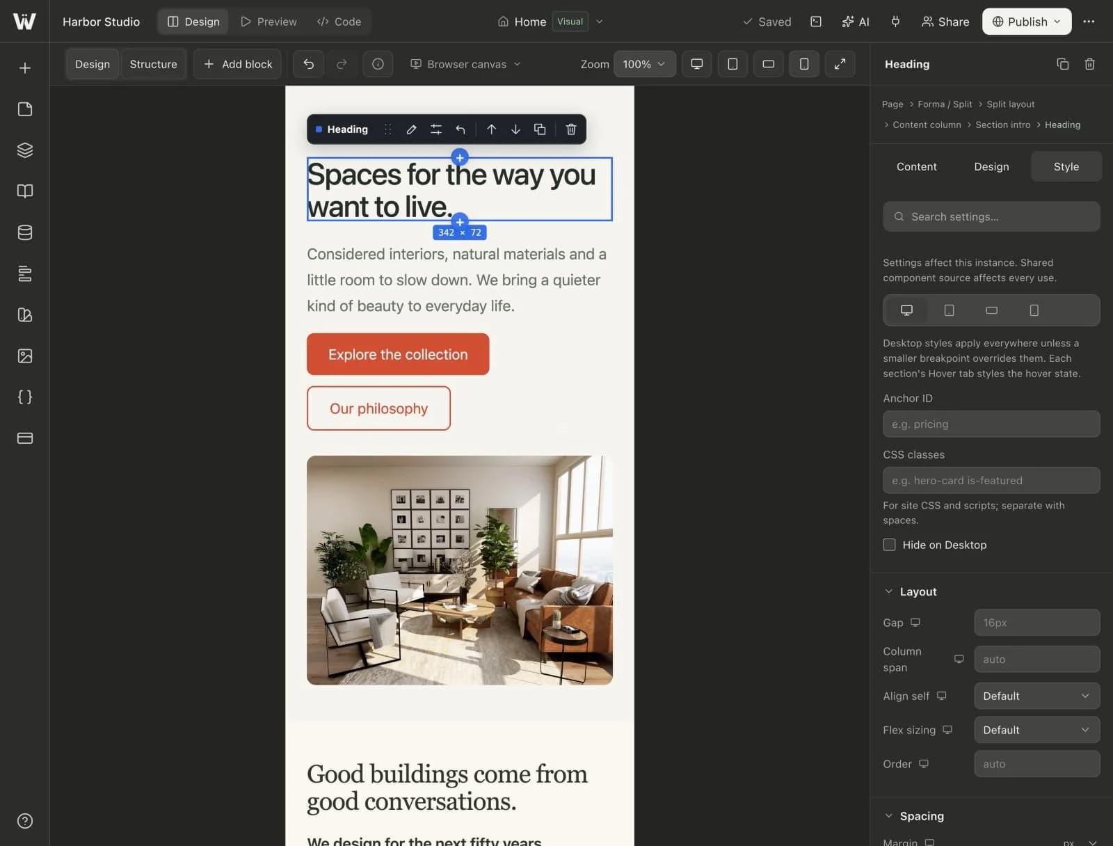
The canvas switched to the mobile breakpoint at 100% zoom, with the Style tab beside it.
Real screenshot of the Webyaam builder with a demo site.

Workflow

  1. Lay out the page at desktop width.
  2. Switch the canvas to tablet, landscape or mobile.
  3. Override only what needs to change, such as font size or column count.
See it in the productResponsive designStyles for desktop, tablet, landscape and mobile.